Four Seconds to Convince a Ten Year Old
The book cover has less time than you think

July 1, 2026
Hello friends,
Picture two books about the same kind of true story. One has a kid mid-sprint, sky on fire behind them, a subtitle that reads like a dare. The other has a black-and-white portrait and a title in Times New Roman. Both are well-researched, well-written, completely true. Only one is getting picked up off the shelf today. Can you guess which one? Hurry. It will take only 4 seconds for the reader to decide.
Right now, I'm writing a narrative nonfiction book for middle graders, scheduled for release in Spring 2027. Months ahead of its release, a cover is needed for thumbnails in catalogues, websites and press releases. I haven't finished the manuscript, but my publisher is already into decisions about the cover. I'm lucky to be included in that conversation — plenty of authors aren't consulted on title, subtitle, or cover design at all.
We tell kids not to judge a book by its cover. But the cover is doing real work — for the reader deciding whether to pick the book up, and for everyone behind it, from author to publisher to bookseller. Get the design wrong, and a good book can sit on shelves for a long stretch, unread. Get it right, and the odds of that same book being picked up, opened, and read climb fast.
For my book, those choices carry extra weight. Narrative nonfiction – true stories that read like fiction – must convince a kid scanning the shelf that the story contained between the covers is as gripping as a fictional one. Done well, the cover should shout excitement and promise the reader that a thrilling ride resides across the pages inside.
So, what matters to middle graders when it comes to cover design? Research is sparse, but here are some key factors:
Title/subtitle: Titles are short and often punchy, but the subtitle does the heavy lifting. It tells the reader directly what the book delivers. Often the words "a true story" or "inspiring true story" are included in the subtitle, signalling to the youngster that this isn’t fiction, a textbook or a summation of facts, but a story that really happened.
Placement/size: The title is often the largest single element on a cover – as much as 60% of the space - with the subtitle coming in second. According to one book designer, the title should appear at the top, never along the bottom where it might be hidden by other books laying across it on a table.
Colour: Kids are attracted to vibrant colours. According to miblart, a cover design website, yellow, orange, blue, and red dominate nonfiction covers, with yellow signaling happiness/well-being, orange signaling energy and optimism, blue signaling trust and calm, and red signaling excitement. Middle-grade narrative nonfiction often borrows fiction's saturated, high-contrast color schemes specifically to not look like a textbook
Image: Rather than using a static portrait which might signal textbook to young readers, images with a mysterious, exciting quality that raise questions and speak to the content of the book attract the eye.
With these points in mind, here are some middle years narrative non-fiction books with covers that do their job:
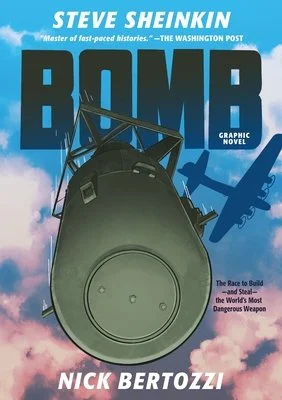
Bomb works because every element is doing the job fiction usually does, not the job textbooks do. The cover refuses to look educational. It presents itself as a page-turner first, true story second and poses a question with its dramatic image. The subtitle - The Race to Build – and Steal – the World’s Most Dangerous Weapon - delivers the stakes in one breath, so the reader doesn't have to guess what kind of true story this is.
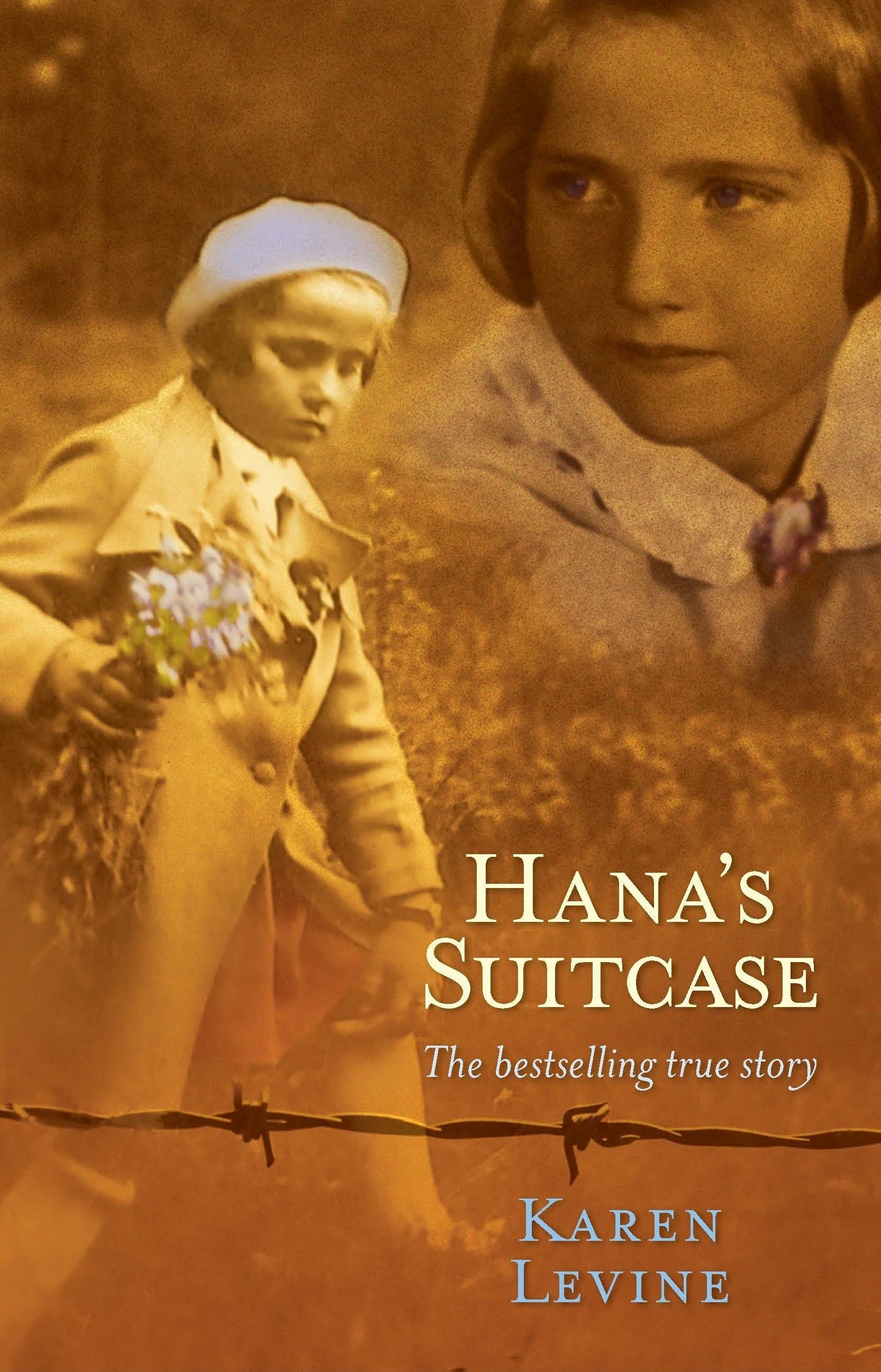
The overlay of images on the cover of Hana’s Suitcase immediately says there is a personal story inside. Unlike the drama of Bomb, the yellow colour, aged look, and simple subtitle – “a true story” – reflect the tone behind this Holocaust story. The barbed wire running along the bottom seems to underline the subtitle, and the title itself, is mysterious, raising questions. Suitcase? What suitcase? How does a suitcase play into the story?

Also by Steve Sheinkin, The Port Chicago 50’s stern looking figure surrounded by others who appear to be standing on his shoulders suits the dramatic story of a fight with profound consequences. The red colour signals excitement. The subtitle says it all while the title raises intriguing questions. Fifty? What happened to fifty people at Port Chicago?
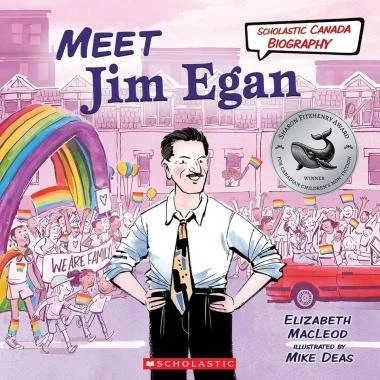
The cover of Meet Jim Eagan works on several levels. The background highlights the figure at the center, drawing attention to the subject of the book, activist Jim Eagen, and the movement he supported. His stance - hands at his hips, defiant stare – show his determination. The rainbow to the left, ‘we are family’ banner, and crowd waving flags speak to the theme of inclusivity and leave no doubt about the LGBTQ2S+ subject matter.